Zabriskie Point is wild

Most of Zabriskie Point is shot with 70s-style telephoto zoom lens, just pointing the camera at whoever is speaking. Nothing spectacular.

Then the movie goes out to the desert and this shot really made me lean forward and pay attention.

The airplane appears in the background while Daria fixes her car. Closing the hood reveals the airplane again. It even appears in the thin slit of sky between the door and roof! That’s so hard to do!

Speaking of precisely positioning the airplane, here’s a terrifying stunt. Respect to the stunt performers!


That’s no stunt performer! They put the lead actress in that car and aimed an airplane at her.

Later they cut to a close-up to emphasize a line of dialog, but the camera is on the wrong side! I never know what to expect with this movie.

Baffling DVD covers

The Debt is a grim spy thriller where a retired team of spies reflect on the most important day of their lives: the completion of a vital mission for which they are famous.  Rachel (played by Jessica Chastain in the past) is attacked and permanently scarred during the mission.

Rachel walks on an airport tarmac with a bandage on her right cheek.

The movie match-cuts from young Rachel to old Rachel (Helen Mirren). The scar is how the audience identifies the character.

Older Rachel, with a scar on her right cheek, thinks about her younger days.

Now look at the DVD cover…

Part of the DVD cover of "The Debt" There's a big picture of Rachel, but her scar has been removed.

The scar is gone! The mark that identifies the character! The constant, unavoidable, physical reminder of the most important event in the movie, and of the character’s life! They chose to put her right cheek in the center of the biggest image on the cover, and then removed the extremely important thing on that cheek. There are so many ways to not do this.

  1. Just show the scar! People have scars sometimes.
  2. Definitely emphasize the scar because it’s very important to the movie
  3. Pick any of the other actors to put on the cover
  4. Pick any other angle on Helen Mirren that doesn’t emphasize the right cheek
  5. Pick a wider shot of Helen Mirren so the scar isn’t so big

I trust this statement will be uncontroversial: Rachel McAdams is gorgeous!

Rachel McAdams in The Time Traveller's Wife. A pretty young white woman with brown hair pulled back in a ponytail, smiling at someone.

Those cheekbones! The little creases she gets when she smiles! Her lower eylids are so expressive! So imagine my surprise when I see the cover of the DVD this image comes from.

Part of the DVD cover ofThe Time Travelers Wife. Rachel McAdams lying down, wiht Eric Ban lying on top of her romantically. Her face has been smoothed, removing her specific features

All those features are gone! Removed to make her face smooth and perfect. Maybe some marketing person thought, “We need a conventionally attractive woman on the cover to attract viewers!” but the casting directors already had that covered because they hired Rachel McAdams! Why replace a specific beautiful face with a generic beautiful face?


I love people for being themselves. Specificity and uniqueness are delightful. Attempts to make people more normal and less distinct seem cruel to me. Especially in entertainment. Especially for women. Even a spectacular woman like Rachel McAdams isn’t good enough to advertise her own movie. Her face must be changed to be more acceptable. Even a vital detail like the scar on Helen Mirren’s face–which defines the character and emphasizes the grim, violent tone of the movie–is unacceptable. “Stop it,” I yell into the wind.

Keep It Close

Mission: Impossible – Rogue Nation (2015)

Action and violence in a story (I use movies as my examples) can be fun, humorous, empowering, or spectacular. But I want to talk about action that makes the audience worry about the characters. How can we, as storytellers, maximize the apparent danger to the characters, and maximize the audience’s fear for their safety? Going bigger and louder isn’t the answer. It’s hard to keep track of 30 enemy soldiers, and blowing up the whole world seems abstract. No, for maximum peril, put the threat right in the character’s face and give them time to look at it. Keep it close.

This kind of danger has three axes. I’ll provide examples of the extremes, but remember that they are continuums, not binaries.

  1. Intimacy: How close is the threat to the character?
  2. Vulnerability: If the threat is not neutralized, how badly will it hurt the character?
  3. Speed: Does the audience (and the character) have time to understand the threat?

Intimacy: Far

The whole scene is a joke that the knight is not threatening at such a distance.

A knight charging into battle, far across an open field.
Monty Python and the Holy Grail (1975)

Intimacy: Close

Dodge This! There’s no room to dodge. No space between the threat and the character.

The Matrix (1999)

Intimacy: OVERFLOW

Body horror is especially potent because the threat is already inside, in a place that should be completely safe and under control.

Princess Mononoke (1997)

Vulnerability: Safe

She’s got a metal body and knows a secret martial art. She’d be fine even if she lost this bar fight, which she clearly won’t.

Alita: Battle Angel (2019)

Vulnerability: Dangerous

A point-blank shotgun blast will kill a normal human.

The Terminator (1984)

Speed: Fast

The opponent’s strikes are so quick that the character can either handle them, or she’s already lost.

Crouching Tiger, Hidden Dragon (2000)

Speed: Slow

This creature isn’t moving, so the crew has time to try various ways to remove it and realize that none of them work.

Alien (1979)

Speed: Too Slow

The soldiers and Jeeps can’t keep up, so the Iron Giant just leaves. If the threat has no effect for a long time, or gives the characters plenty of time to prepare, it’s less threatening.

The Iron Giant (1999)

Combine these three axes to create especially intense moments.

  • Dangerous: Drowning is lethal.
  • Close: She’s gasping for the last inches of air as the water fills the cabin
  • Slow: The water rises slowly, and drowning is a slow death.
The Abyss (1989)

Another way to increase the danger is to use multiple threats. In the Abyss, even if Linds doesn’t drown right now, she’ll soon be vaporized by a nuclear explosion, and if that is prevented, she’ll suffocate later when the damaged rig runs out of oxygen. Too Slow threats now loom large in the distance. The disaster has reserves. Do you? To escape more than one threat, the character must use some or all of the following:

  1. Simultaneous solutions: The character needs to do more things than they have time for. Too Slow threats are now fast enough to be worrisome.
  2. Different solutions: If multiple threats can be neutralized by doing the same thing repeatedly or skilfully, that’s just one big threat.
  3. Opposing solutions: Neutralizing one threat makes another threat worse.

Here’s an example from Jurassic Park, where Lex is about to be:

  1. drowned in mud
  2. crushed by the car
  3. eaten by the dinosaur

The crushed car makes escaping the mud difficult. The mud makes escaping the car difficult. Inside the car is the only shelter from the dinosaur. Truly a terrible situation!

Jurassic Park (1993)

A special shout-out to portals like doors and windows, which give you close and slow for free.

Jurassic Park (1993)

Portals can also be used for irony: showing characters something they want or need, but denying them access.

Paddington 2 (2017)

Some tips for portraits

Zoom/Magnification/Field of View/Focal Length

Focal length is measured in millimeters from the front of the lens to the back. A prime lens has only one focal length, e.g. a 50mm lens. Zoom lens can zoom in and out and have a range of focal lengths, like 28-135mm.  A small focal length, like 10mm or 28mm is wide-angle. Large numbers like 135mm or 200mm are telephoto and magnify a small area, like a telescope.
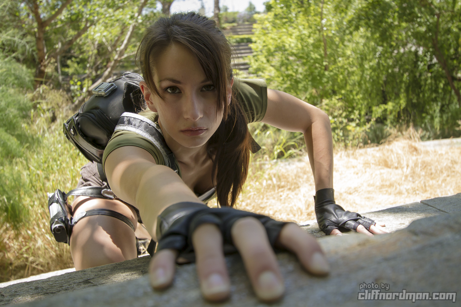
Wide angle

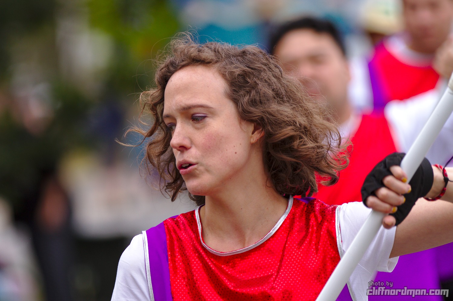
A wide-angle lens will exaggerate poses, which is good for fun, energetic moods. It’s dramatic, but can easily look weird or unnatural.  Small changes in subject’s pose and your camera position can have a big impact, so if a picture looks weird, make some adjustments.

Wide-angle images have a lot of distortion around the edges, so avoid putting people’s faces near the edges.

Wide angle lens will include a lot of the background, so it’s more important to have a background that you actually want in the photo.
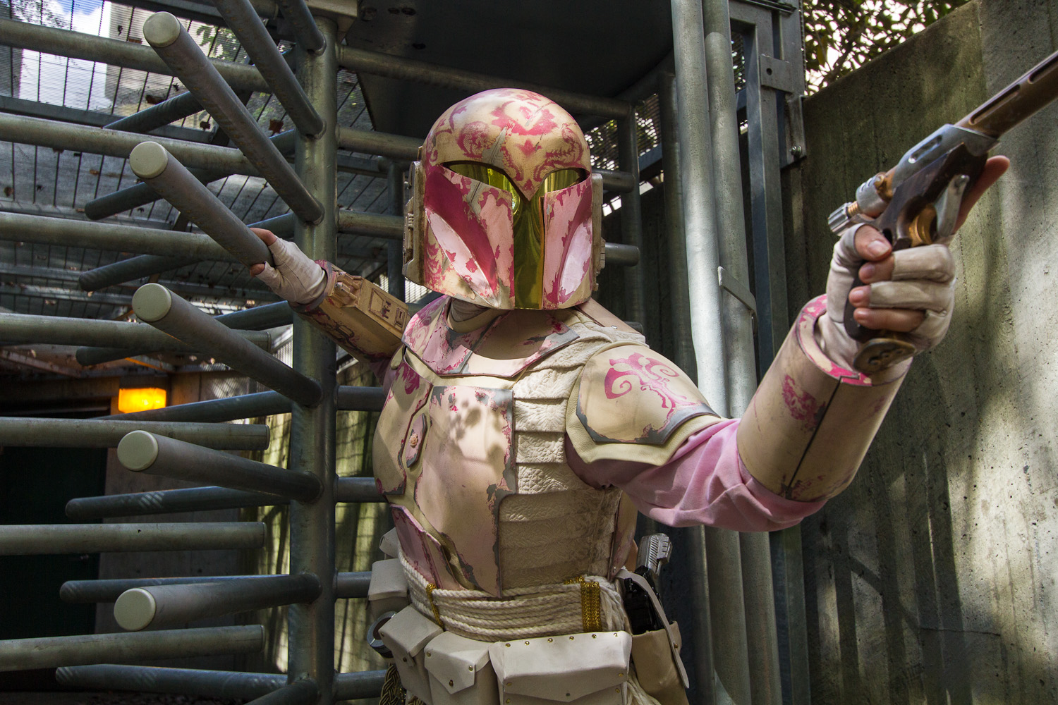
Telephoto

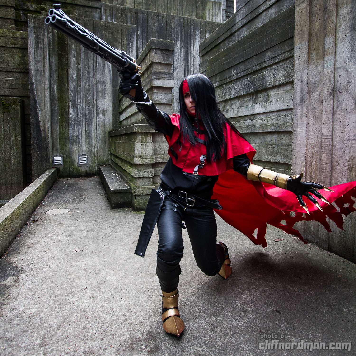
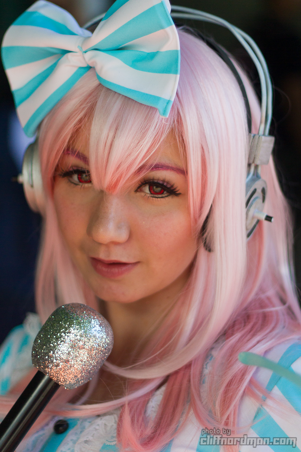
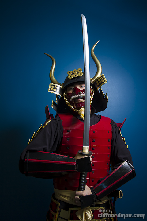
Telephoto lenses let you fill the frame with a subject even from a good distance away. That can be nice, but sometimes you won’t have enough room to properly use a telephoto lens.  Telephoto lenses have less distortion than wide-angle lenses, so they are good for photographing faces.

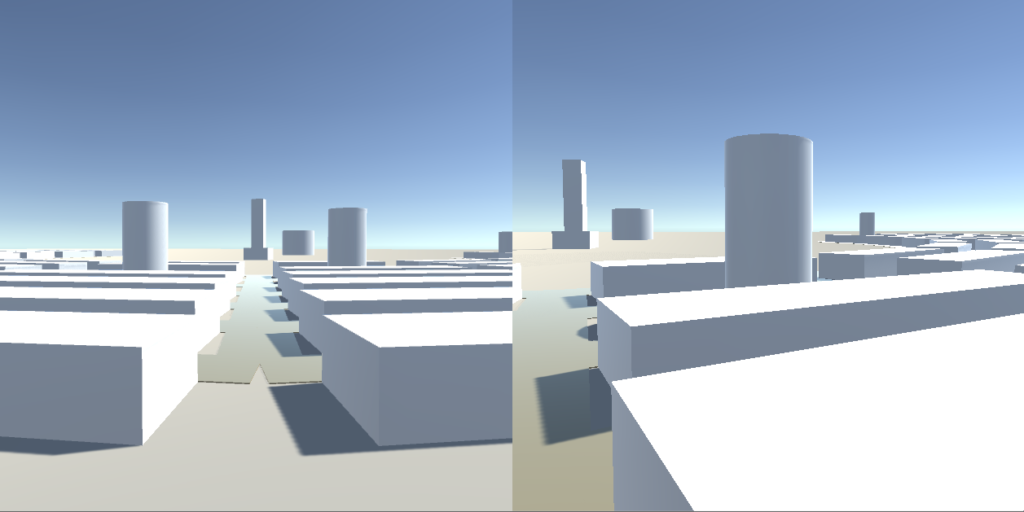
Telephoto lenses compress distance and make things look closer together. Compare the two photos below. The distance from gun to face is about the same in both, but they feel very different.

Wide-angle lens: high distortion, expanding distance

Telephoto lens: low distortion, compressed distance

Depth of field

Depth-of-field is a range of distances from the camera in which objects are in focus. Small f-stop numbers like f/2.8 give shallow depth-of-field. Big f-stop numbers like f/16 or f/22 give a deep depth-of-field.

Shallow

Shooting “wide open” with the smallest possible f-stop lets in the most light and has the shallowest depth of field. This is good for isolating the subject and melting the background into blurs, called “bokeh” That’s good for calling attention to one object, making the background less distracting, and for being pretty in general.

The drawback of shallow depth of field is that only one thing is in focus. The photo above shows one dancer very well, but the dancer behind her is completely blurry.

A closeup with a narrow depth of field could have a depth of field of one inch or even less! See how her cheek and hair on camera left are out of focus, while the eye on camera right is sharp. Be very careful with your focus in these situations. Focusing on the near eye is a safe play.

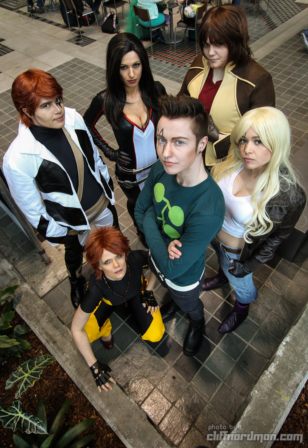
If you’re photographing more than one person, either be very careful to get them all the same distance from the camera, or increase your f-stop so the depth-of-field is big enough to cover all of them.

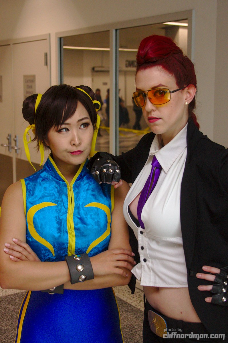
See how the background isn’t as blurry in this shot of two characters? That’s because my depth of field is bigger to make sure they are both sharp.

Deep

Use a big f-stop number (f/16, f/22) to get deep depth of field. Beware that this reduces the amount of light coming through the lens, so you’ll have to trade exposure time or ISO.

It’s easy to get multiple people in focus, even if they are different distances to the camera

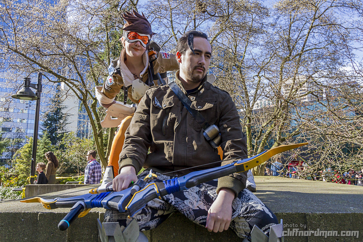
Everything is mostly in focus, so the subjects feel more connected to their surroundings. That’s a benefit when you have a nice background.

Everything is mostly in focus, so distractions in the background are hard to hide. That’s a drawback when the background is messy, ugly, or hard to control.

Some artistic things I like

It will take a while to figure out the exact kind of photo you like to make. Try lots of things and pay attention to how you and your subjects react to them! What I love may be boring or ugly to you and that’s OK! Even if you don’t like the following examples, think about why you dislike them and you may get closer to what you do like.
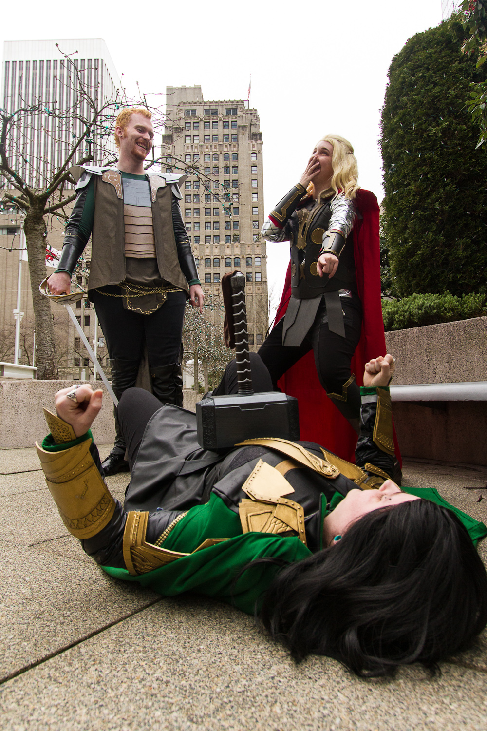
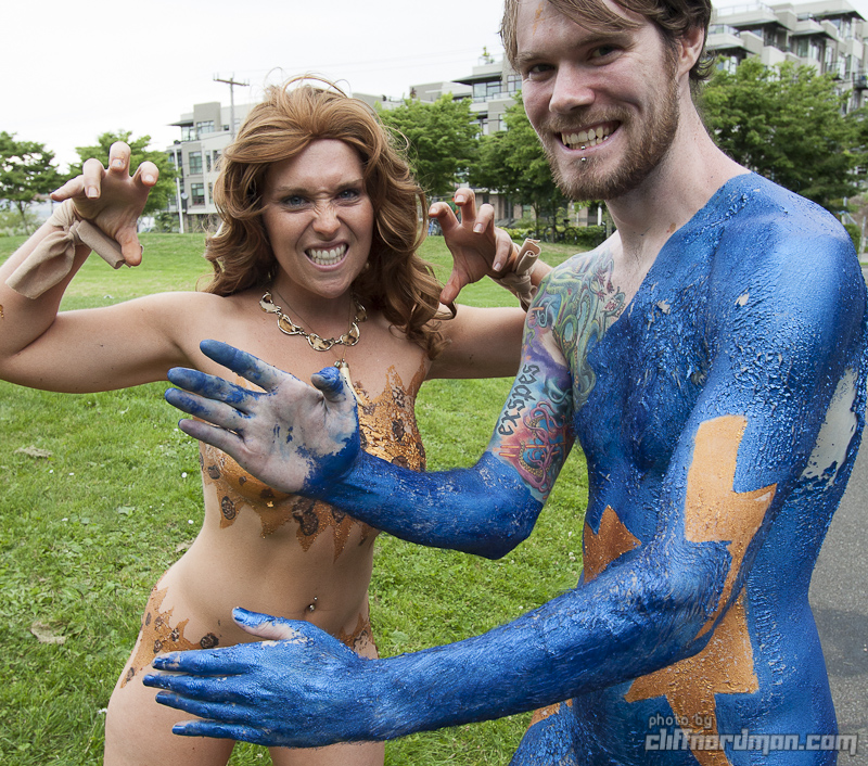
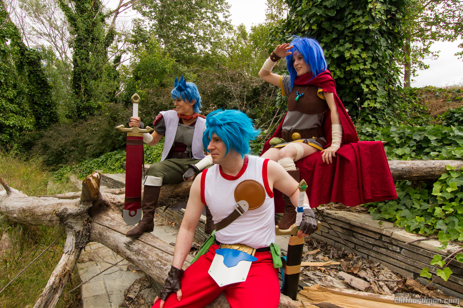
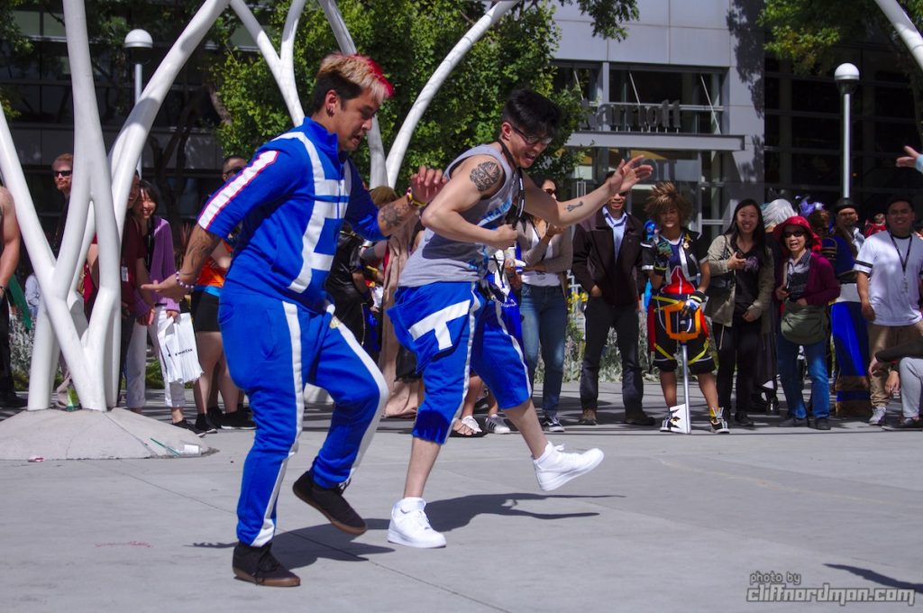
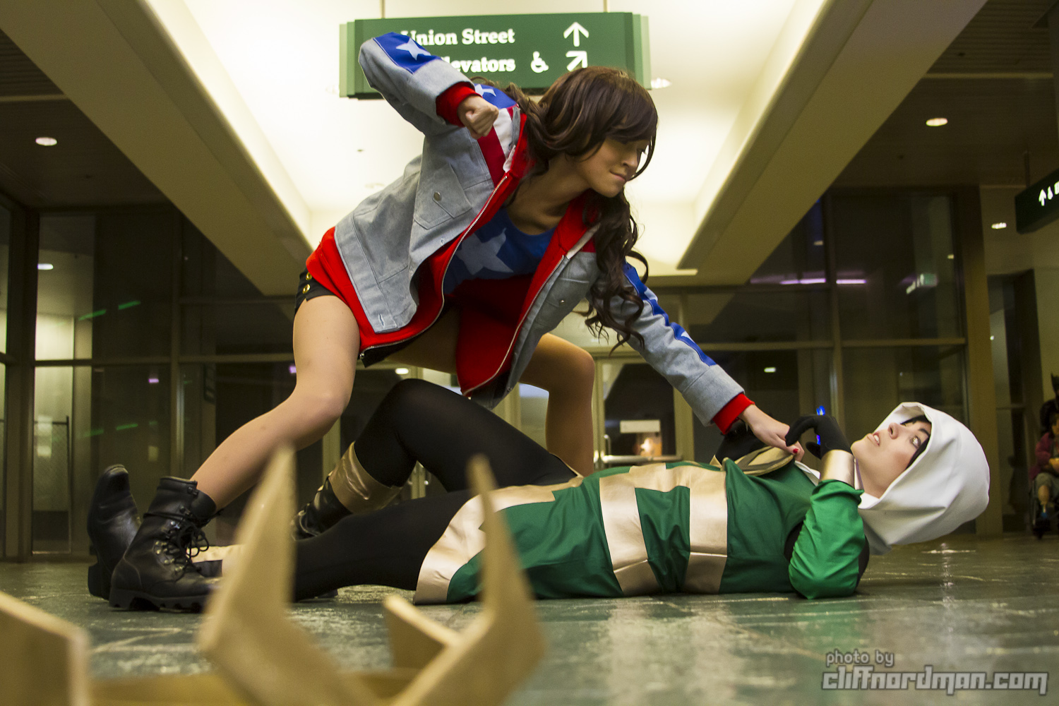
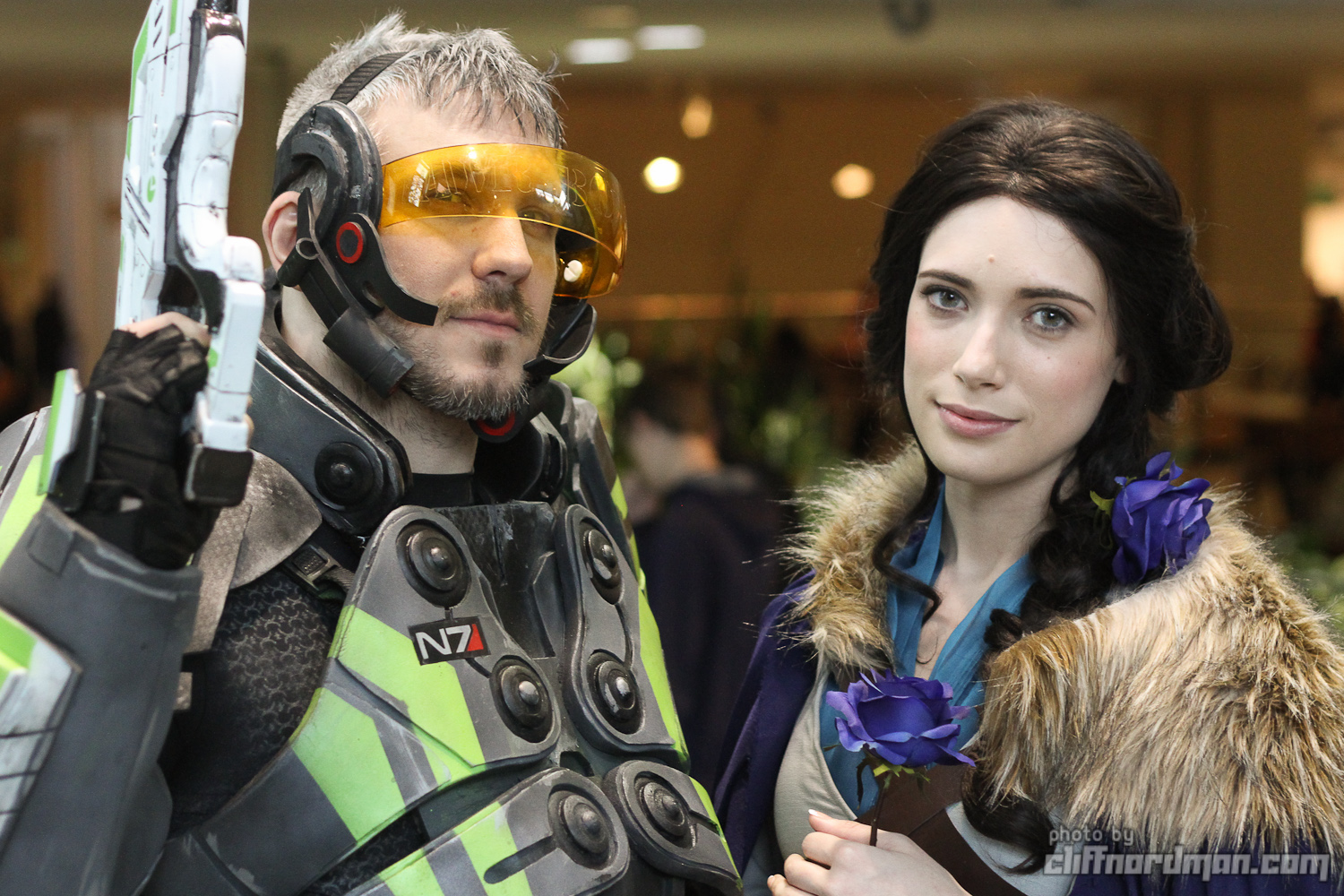
People interacting

Interaction is specific and revealing. I like portraits that show who people are (or who they are pretending to be) and interacting with others can be a way to reveal that.

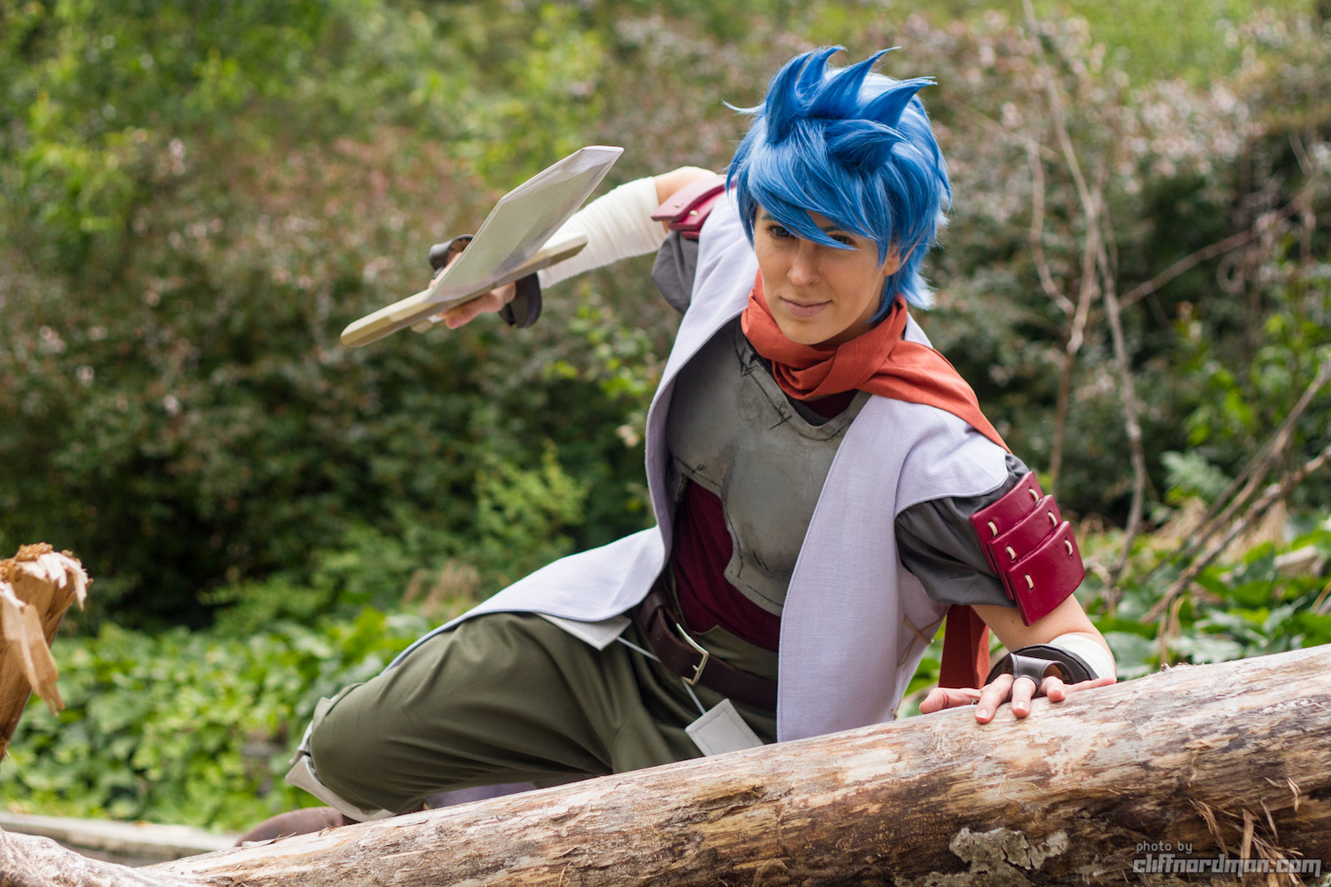
Backgrounds: use them or lose them

If I can, I want the background of a photo to be part of the story. That can be challenging. I have to know the subject’s story and be able to walk to a place that matches.

Interacting with the environment is active and specific. This picture wouldn’t exist without the fallen log.

If I can’t find a good background, I aim for a non-distracting background…

…or melt the background into irrelevance with bokeh (What camera setting would do that?)

Depth and layers

I like things happening at all different distances from the camera.

Photobook recommendations: Look at all the people!

Don’t trust algorithmic recommendations, advertisements, or SEO. Get recommendations from real people whose opinions and tastes you trust.

I love people! Each person is unique and individual, and as a group humans are wildly different from each other in every way imaginable. Atlanta Fashion Police uses “diversity via repetition” to reveal this. The project has a very specific theme: people in costume at Dragon Con holding a mugshot sign. The individuality of the people in the photos contrasts the sameness of the photographs.  Here are some photobooks from my collection that also show diversity via repetition.

A tragically necessary disclaimer

  • To the best of my limited knowledge, none of these photographers are abusers.
    • Some the people pictured are!
  • No art justifies cruelty to actual human beings.
  • Don’t tolerate any artistic collaborator who doesn’t respect you.

Athlete by Howard Schatz

Schatz’s lineups of Olympic athletes from different sports are so famous that you’ve probably already seen stolen copies floating around the internet. Buy this book to see the legit, full-size images.  Another meme says “this is what peak performance looks like” but Schatz shows that peak performance looks different depending on what’s being performed. Even in the extremely rarified environment of world-class athletic competition, bodies are very different. The pinnacle of human physicality does not exist. It’s a mountain range.

Breaking All The Rules by Ger Tysk

Tysk pairs photos of cosplayers with short interviews. Despite the range of ages, locations, professions, skillsets, and fandoms, all these people are united by their love of making and wearing costumes.

Cosplay In America & Cosplay In America V2 by Ejen Chuang

Ejen’s a fellow cosplay photographer and I’ve enjoyed hanging out with him at conventions.  In Volume 1 he photographs cosplayers with a single light and a grey backdrop. In Volume 2 the grey backdrop returns, but he increases the scope of the book significantly, photographing cosplayers in their homes as they build the costumes, and at conventions as don the complex costumes and mingle with fans and other cosplayers. I see so many of my friends in these books I can’t help but feel good when I look through them.

DPBBBV 2020 aka Daily Portrait 5 by Martin Gabriel Pavel

A massive book for a massive project spanning several years and countries and over 400 people.  Pavel photographs nude people doing odd things in quirky locations: places that may soon be revitalized or gentrified into clean conformity. Pavel’s eye for uniqueness extends beyond the people in his photos to the spaces they inhabit or visit.

Hips by Patrick Roddie

Roddie’s website is gone, but archive.org loans out a virtual copy of the book, and used copies are available. The most rigorous implementation of “diversity via repetition” in this list. Every photo is framed the same way: a hand, a hip, and a belly. Each pair of hips on a spread shares some commonality: pop-tab chain-mail, pregnant bellies, matching tattooes, walkie-talkies, leopard print (fabric on one, bodypaint on the other). All the hips belong to attendees of Burning Man, so there’s significant nudity, emphasized but not sensationalized by the framing.

Humans by Brandon Stanton

A popular street photography blog traveled around the world, photographing people and listening to their stories. Many stories are sad or poignant, so I only flip through a few pages at a time. Street photographers can easily treat people like props, but Stanton takes time to respect their individuality and learn specific details that aren’t obvious from a photograph.

The Nu Project, Volume 1 and Volume 2 by Matt Blum and Katy Kessler

The goal is to show “beauty in every body” by photographing “normal” women (not models) nude in their homes.  Pets and babies and housemates are also welcome.  The light is so soft and pleasing. Everyone seems so happy and comfortable. Blum is a wizard for getting strangers and non-models to open up like this. So many open smiles and big laughs.

The People of Burning Man by Julian Cash

Alas, the book is out of print and the author’s website is gone. Cash photographed people at Burning Man against a white background, often with a fish-eye lens.  Like the festival it’s based on, this book is full of surprises:  Yogis forming every letter of the alphabet with their bodies, paper dolls to cut out and dress, match the faces with the tattoos, hugging, bodypaint, dancing, nudity. An explosion of color and creativity and fun.

Reasonably secure contact card

This weekend, I will photograph the Fremont Solstice Parade and the Solstice Cyclists from the 12th year in a row.  These two related but separate events are glorious local tradition of joy, creativity, and public nudity.  In years past, I’d upload all my Solstice photos to a public gallery. Other users could comment on the photos and add them to collections.  Wow, did I see a lot of disgusting, disrespectful comments and photo collections!  Alas, creeps & voyeurs use this glorious event, which should be about freedom & joy & self-expression, to make the nude cyclists uncomfortable.

Privacy for nudists

Thus my quest to make my photos invisible to the general public, but easily accessible to people I photograph in passing.  One year, I put all my photos on my own website and only posted the link on the private e-mail list for the Solstice Cyclists.  Someone on that list made a publicly-accessible page of links that included my private link. Apparently I can’t share things in confidence, even on that private e-mail list.  Another year I put all my photos on my own website, but this time the only place the address appeared was on contact cards that I gave out at the event.  My website’s logs indicated a lot of traffic to certain images, so someone probably shared links to them. I could guarantee that no one could publicize someone else’s photo by delivering all photos via e-mail, but many Solstice Cyclists prefer to remain anonymous and don’t want to give out their e-mail addresses to photographers they’ve just met.

So how can I deliver photos only to the people in the photos without getting contact information from those people? My solution this year is to pass out unique contact cards to each person I photograph. Each card will have a different URL printed on it.  When I hand out a card, I’ll take a picture of the card and its recipient.  When I process photos later, this will tell me which photos to upload to which URL.  The URLs are generated from a large list of English words, so they will be easy to remember and type. The word list is large enough that it won’t be easy to guess someone else’s word from looking at your own.  The words aren’t all colors, or names of birds, or adjectives.  If people lose their cards, they won’t be able to find their photos, but previous solutions had the same problem. Nude people rarely have pockets, but people in previous years have stuffed cards into socks, bags, helmets,etc.  If they have phones, but no pockets, they can photograph the card & keep a virtual copy.

Generating the cards

I obtained a list of 1000 words from a site for crossword puzzle enthusiasts. I read through the list and removed any words with possible negative connotations, like “bizarre”, “murderer”, “chunk”, and so on.  That left me with about 730 words.

In a word processor, I made a mockup of the contact card, using the longest possible word in the URL to make sure it would fit on one line. Once I had one card, I copied-and-pasted dozens of times to make sure it would fill up one page and wrap to the text properly. I had to adjust spacing and font size a few times, but I ended up with a card that would print 16 to a page.

I wrote a python script that would pick a word from the word list, insert it into the text of the card, and write that to a file.  One loop for 10 pages and another loop for 16 cards per page, and I had a text file with 160 unique URLs. I copy-and-paste that into the word processor with my carefully tuned formatting, and everything lines up. It’s so nice to see rows and rows of identical text, except it’s not quite identical. Every card has a slightly different URL.  Print and cut and I’m ready for the parade!

PROCJAM / 7DFPS 2018, Photo Copy: final push

PROCJAM, 7DFPS

Day 1, Day 2, Day 3, Day 4, Day 5, Day 6]

Play Photo Copy in your browser!


Time was almost up, so I concentrated on getting the game into a playable state.  After breaking the AI photographer the day before, I needed a quick way to make it functional again. I added an invisible box around the extents of each landmark and had the AI photographer point at that.  Alas, no understanding of symmetry, or lining up multiple landmarks in one image, or any other things I was hoping to implement at the start of the project.

I also cleaned up the menus and functionality to start and end the game.  The introduction used to be a separate scene, but I pulled it into the main scene.  Less to keep track of, and it let the player look at the instructions while playing by hitting Escape.  Alas, walking through the exit portal, then canceling the exit UI was causing trouble, and it was faster to cut the portal than to debug it.  RIP Exit Portal. I still believe in diagetic UI.

At this point the player could start the game, enter the world, see photos from the AI photographer, take photos, have them scored, then leave the game.  I exported a copy and uploaded it to itch.io, just so I’d have a working version to fall back on.  I still wanted to add features.

The inspiration for this entire Black Rock City generator was a camp name generator written in Tracery. Since Unity supports JavaScript, I tried just putting the Tracery files in my Unity project, but there were some errors.  Fortunately, Max Kreminski had ported Tracery to C# specifically for use in Unity. (TracerySharp on github) Once I could generate camp names in Unity, I assigned each city block a name.  When the user “looked” at a camp (when a ray from the center of the screen intersected the block’s collider) the name would appear on screen.

This added a lot of character to the city.  Just running from camp to camp, reading the amusing names was fun.  This technique was easily extended to the street signs as well, so the player could actually read the street signs by looking at the them, which really makes the city feel like a real place.

My mind raced.  Photos from the AI photographer could be annotated with hints, like, “Found this cool art piece on Echidna street”, “took this picture while chilling at the Undetectable Capitalism Dome”, “some guy told me this thing is called Normie Zone”  Before I started that sub-project, I wanted to be sure that looking at things still worked when two cameras shared the same viewport.  it seemed to work as expected in the editor, but I built an EXE to be sure.  IT worked differently in the EXE.  I built to WebGL, since most people would play it in the browser on itch.io, and it worked a third way!  I did not have time to debug that and add all those new features, so stopped there.

The first version that I uploaded to itch.io would be the final version.  Rushing and stressing were against the spirit of PROCJAM, so I practiced the  skill of knowing when to leave well enough alone.  After I made peace with ending in a stable state instead of working up to the deadline, 7DFPS extended the deadline! Self-control was required to avoid diving in once more.

Play Photo Copy in your browser!

PROCJAM / 7DFPS 2018: Day 6

PROCJAM, 7DFPS

Day 1, Day 2, Day 3, Day 4, Day 5

I’m approaching the end, so I need to wrap things up.  Here are some relatively quick fixes.

Pressing Escape will exit the game, but there’s also a diagetic exit at the end of the 6:00 road.

Also visible in that image is the trash fence. Burning Man is surrrounded by a pentagonal fence meant to catch anything form the city that blows away in the desert wind.  I added a circular fence to keep players from wandering off the edge of the world. The real fence has a square lattice pattern, but I made the width of the fence segments adjustable and I didn’t want to deal with the texture stretching, so my fence has only horizontal bands.

One of the last things I added to my Burning Man simulation was the Man himself.  He’s another low-poly mesh built in Milkshape, although the base is generated with the same Lathe that creates the Temple.

Camp structures will now fill long blocks.  I just re-run the structure placement algorithm with several starting locations along the long axis of the camp.

There are some weird things visible in the above image that aren’t normal camp structures.  Those are landmarks! Yes, I’ve finally added some landmarks to a game ostensibly about photographing landmarks.  There’s a two level-generator that lays out several paths, then puts objects along those paths. It can create.

Balloons (1 thin, irregular path with a large sphere at the end)

Towers ( a line of vertical lines)

Abstract art (irregular paths of irregular shapes)

An unfortunate side effect of these wonderful new landmarks: the AI Photographer doesn’t know how to look at them.  The Burning Man sim has overtaken the photography sim so much that the original goal of the project no longer works.  Whoops!  There’s still a bit of time to re-write the photographer, though.

PROCJAM / 7DFPS 2018, Day 5

PROCJAM, 7DFPS

Day 1, Day 2, Day 3, Day 4

Unity uses two programming languages:  C# and JavaScript.  I use C# because I like strongly-typed languages.  I want to see as many mistakes at compile-time as possible. But Tracery (which I used to generate Burning Man Camp names) is written in JavaScript. Can I just copy the files in to my project’s directory structure? No! Unity finds several errors in files that work just fine in a web browser.  Searching online reveals two people that ported Tracery to C# specifically for use in Unity.  Both authors caution that these ports are completely unsupported, but that’s good enough for me.  I assign a name to each city block, but displaying that name to the user requires learning how to use Unity’s UI features.  I don’t want to deal with that hassle, so I switch tasks!

The Temple was a giant blank cylinder, and the Man was standing on a similarly boring box. I create a Lathe algorithm to replace both.  The Lathe draws some line segments from bottom to top, then rotates that outline around the Y-axis, kinda like a vase.  This is quite-low-level compared to most of what I’ve built.  I’m not using built-in primitives or importing meshes I built in a 3D editor.  I’m creating the object one piece at a time while the game is running. Not only do I have to write nested loops to place each vertex, I have to remember what order I created them, because the triangles are one giant list of references to the one giant list of vertices.  Speed is important at this level, so I don’t get the luxury of a big tree structure of objects. After writing some triangles backwards, and forgetting a few numbers, I get a shape!

What is this? The light acts like it’s completely flat!  I had missed two things.

  1. Unity stores only one normal per vertex, so if two triangles share a vertex, Unity will smooth the join between those triangles.  I want the angular, low-poly look, so I don’t want any triangles to share vertexes.  A quick sketch shows that each vertex borders six triangles, so I have to edit my vertex generation loop so it creates six times as many verticex!  Now the triangle creation loop needs to use each of those vertices exactly once.  Yikes!
  2. The second step is to call the RecalculateNormals() function.  Much easier!

So much better!  You’ll notice that this temple is spikier than a vase.  That’s “star mode.”  I bring a piece of code over from my bodypaint generator that reduces  the radius of every other vertical row of vertices.

After finishing this project, I am ready to tackle some UI work. People won’t enjoy even the coolest game if they don’t know how to play, so I need to explain myself.  I add a title screen with a list of controls and a bit of story.  This is a game about copying photo.s. The original code name was “Art Fraud” But now i’m having second thoughts.  Taking photos in a magical, beautiful place seems so joyful and positive. Do I really want to flavor it as theft and subterfuge? As a compromise, I let the user select Light or Dark stories. There’s no mechanical difference, but the little paragraph re-contextualizes why one has these photos, and why one wants to re-create them.